This is the latest version of a custom UI Kit built for use across an entire enterprise solution.
The custom kit uses Bootstrap 4 as its foundation, with Material Design principals, and a whole range of custom components too.
Because the kit is compatible with HTML or React.js components, it’s ideal for both designers and developers.
Examples of What the Kit Includes:
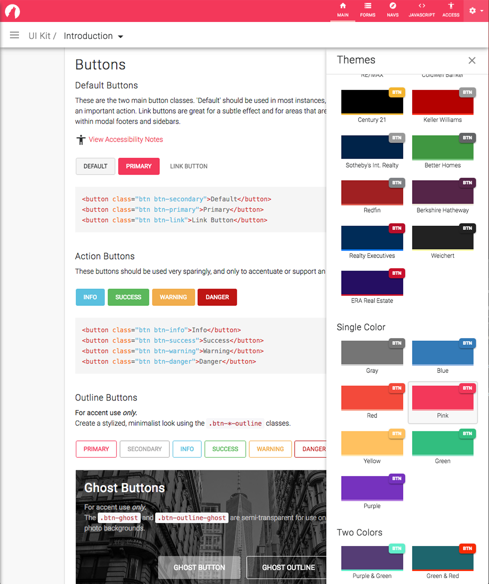
A new theme changer was included to quickly change the look for different real estate brands.
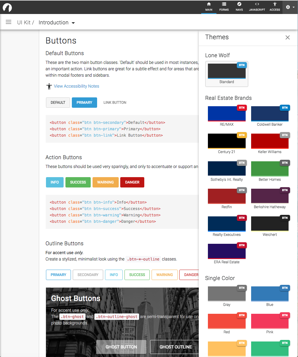
Customers can now choose branded or just-for-fun theme colours for their Lone Wolf products!
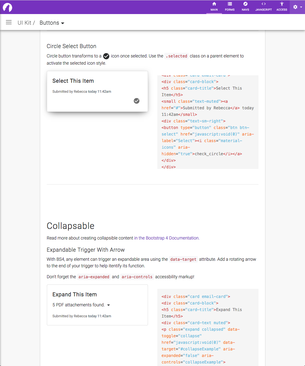
This circle button morphs into a check icon upon click, and then added an active class to its parent .card container. It is supper useful for long lists of card elements or table rows that need to be selected.
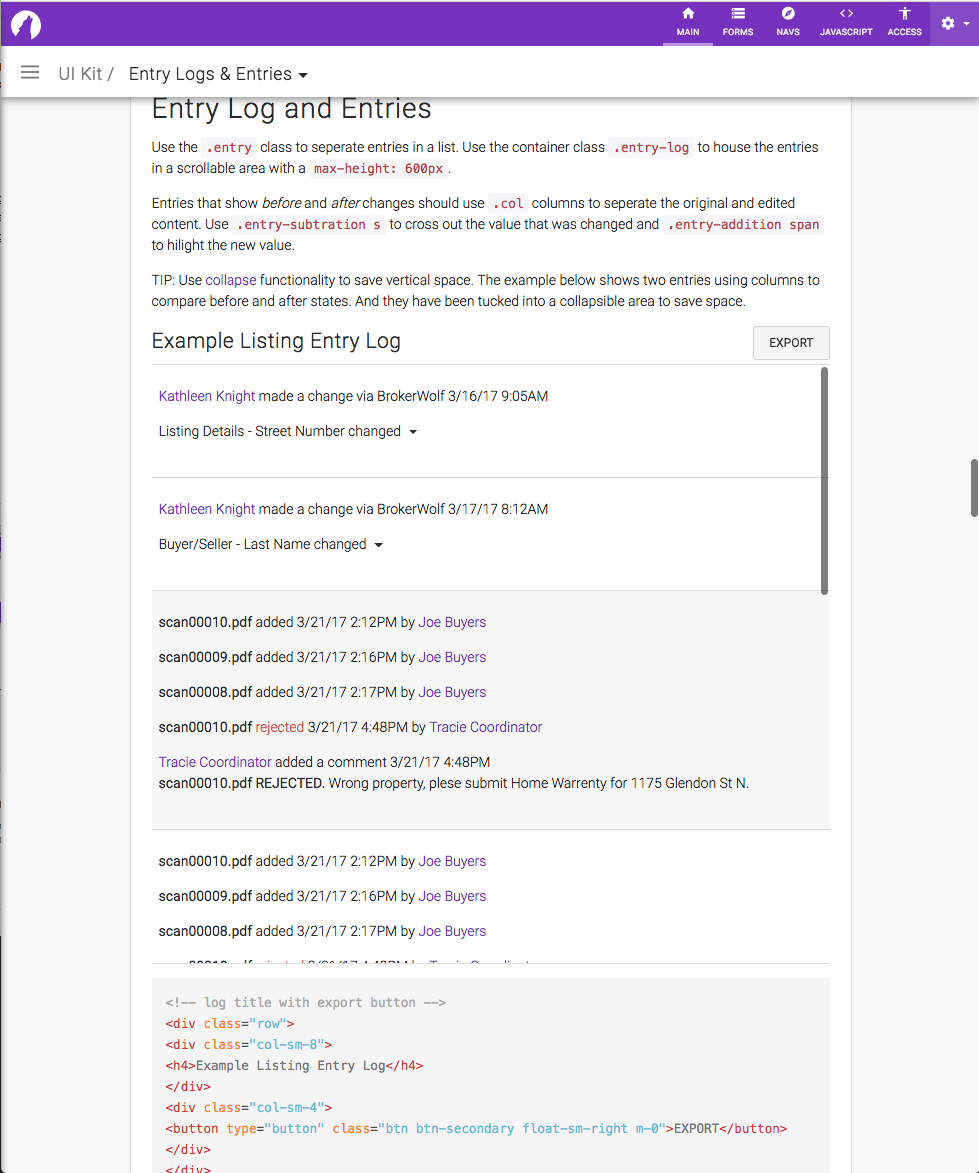
While not the flashiest element in the UI Kit, entry logs are an important component to admins who need a log of all changes made to their Lone Wolf product. This simple element saves our internal customer support team a lot of calls!
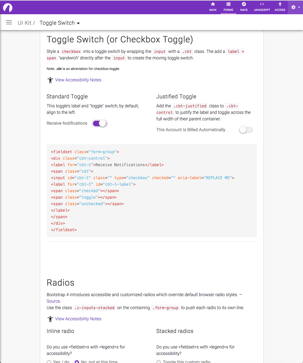
This “toggle” is not only nice looking, it’s also keyboard accessible. You can see from the markup that it is actually a nicely styled checkbox in disguise.

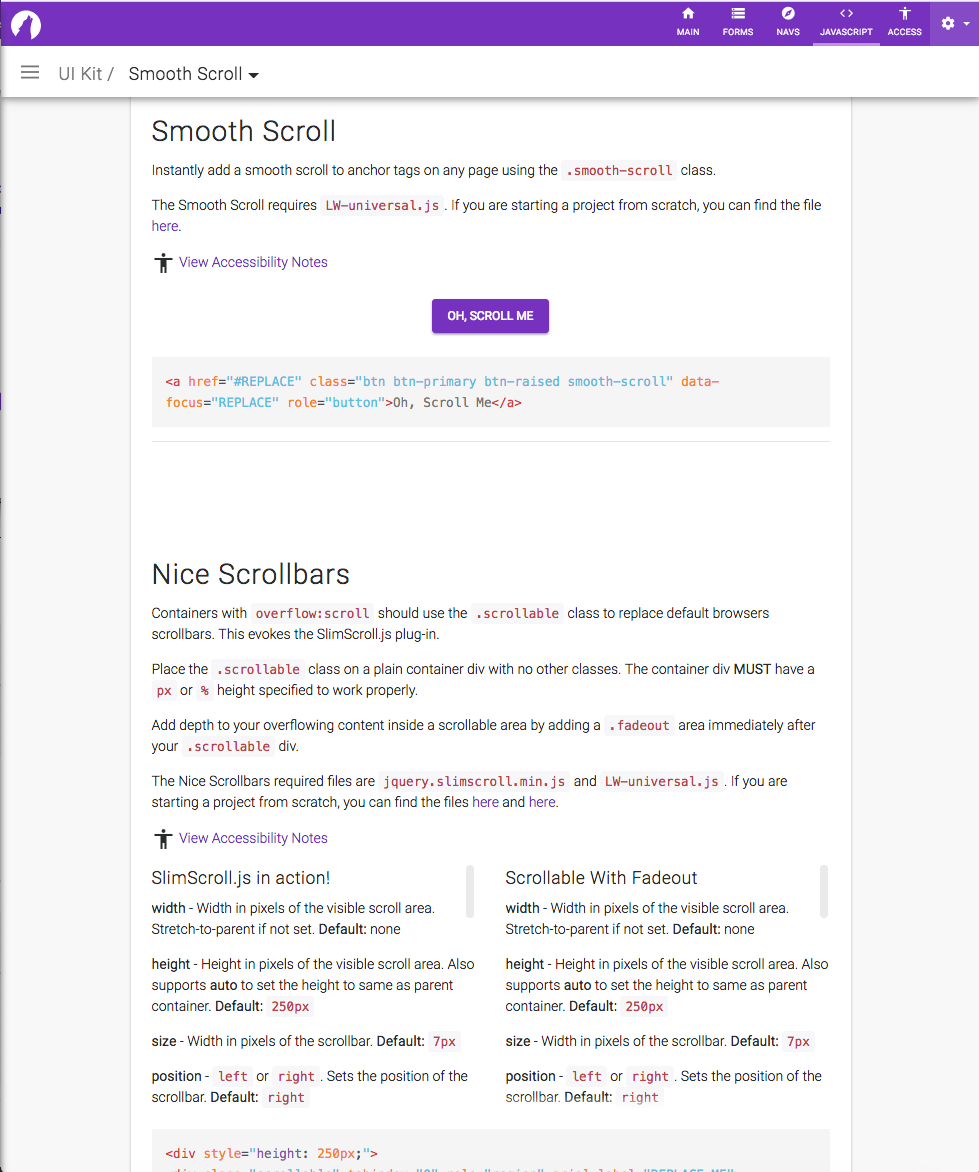
When your element’s contents are too long for the screen, you can easily add a “nice” scrollbar, with or without a fade effect.
There are too many components in the kit to name here! Be sure the check out the code prototype below to see them all: