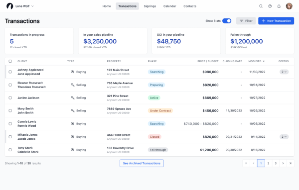
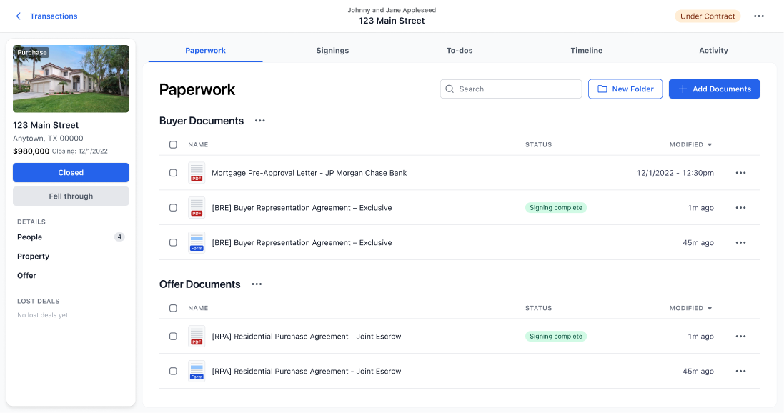
Consolidating and updating two real estate heavy-weights.
Products to be Replaced: TransactionDesk by Instanet and ZipFormsPlus by zipForms | Project duration: currently in progress
Roles: UX Direction, User Research Direction, UI Direction, Component Library updates


The Problem:
The company needs to consolidate 2 different transaction management tools: both with outdated tech stacks and overwhelming UI’s that leave users frazzled. Real estate boards pay big money to offer these Transaction solutions to their agents. But most agents detest the disjointed and clumsy experience of using the existing ones from Lone Wolf.
The Solution:
Get back in touch with our user’s highest priorities when opening a Transaction. Clear away the distractions, allow the user to focus on the *relevant* task at hand, model the flow after the real-world progression of transactions, and introduce a modern UI. Conduct multiple rounds of user validation to ensure that the new UI works for various agents across the US and Canada.
The Plan:
- Transactions has multiple user types, let’s focus on agents and nail that experience first before shaping with Broker and Admin experience, which relies on the Agent tools being settled first.
- Perform competitive analysis on what tools agents are favouring to manage their transactions. Identify any competitive weak spots or gaps in usability in their preferred solutions.
- Conduct user discovery research. Focus on the agents’ (aka: the end user) needs; not their bosses, trainers, or board members. This will increase agent adoption.
- Distill down the agent’s needs when creating a Transaction and figure out when and how their needs change as a deal progresses.
- Make it easy for them to get into the paperwork, since they tend to work mainly there.
- Present UI mockups to users and iterate based on their feedback, stumbling points, points of praise, and “eureka” moments until we get a user satisfaction score of 7.5 +
- Build our flat mockups using our revised Design System (v3).
- Update our React component library with any new assets so other products can take advantage of them.
- Share our findings with the organization, including those in Marketing and Sales, so that the points of praise about the new design can be leveraged.
- Repeat the process for the Broker user experience and the Admin user experience (separate projects.)
UX/UI Design
The new Transactions app was built with our Helix Design System. The UI design established here acted as a cornerstone. The patterns used here have echoed through to other apps within the same suite. This gives a cohesive look and experience across the new products.


This project is actively in the research and design phase.
More updates and outcomes will be shared when they become available.
